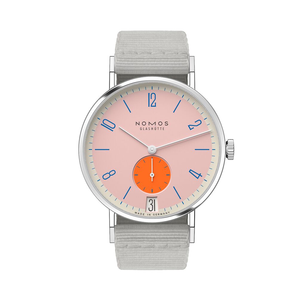
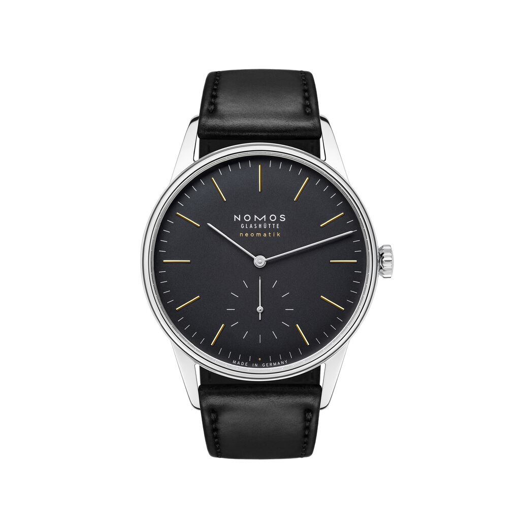
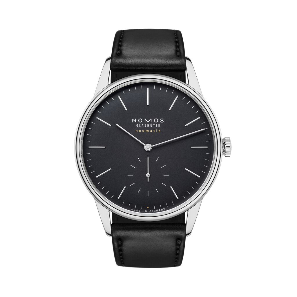
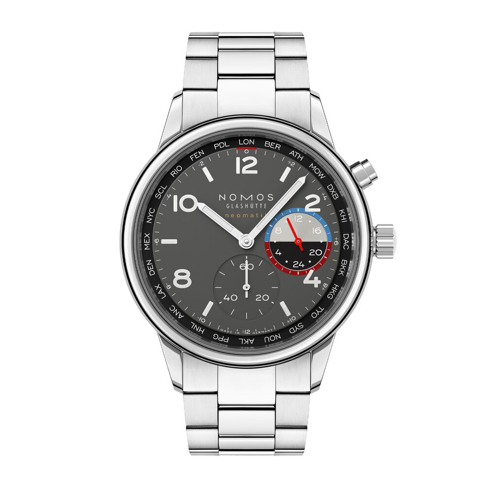
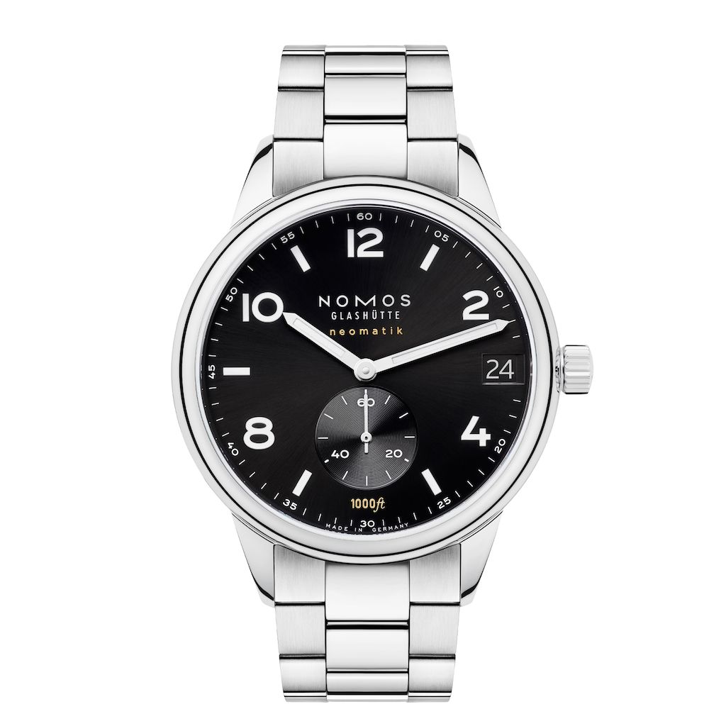
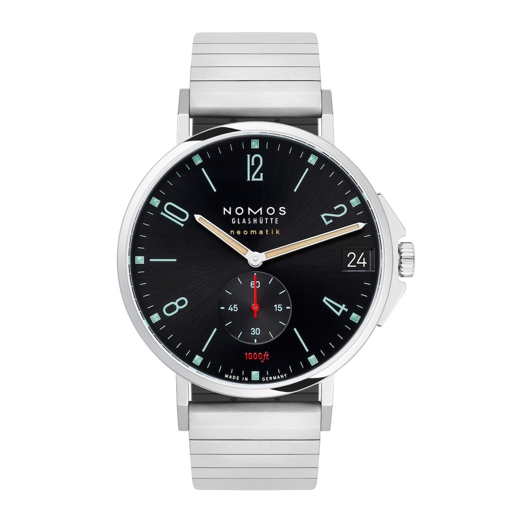
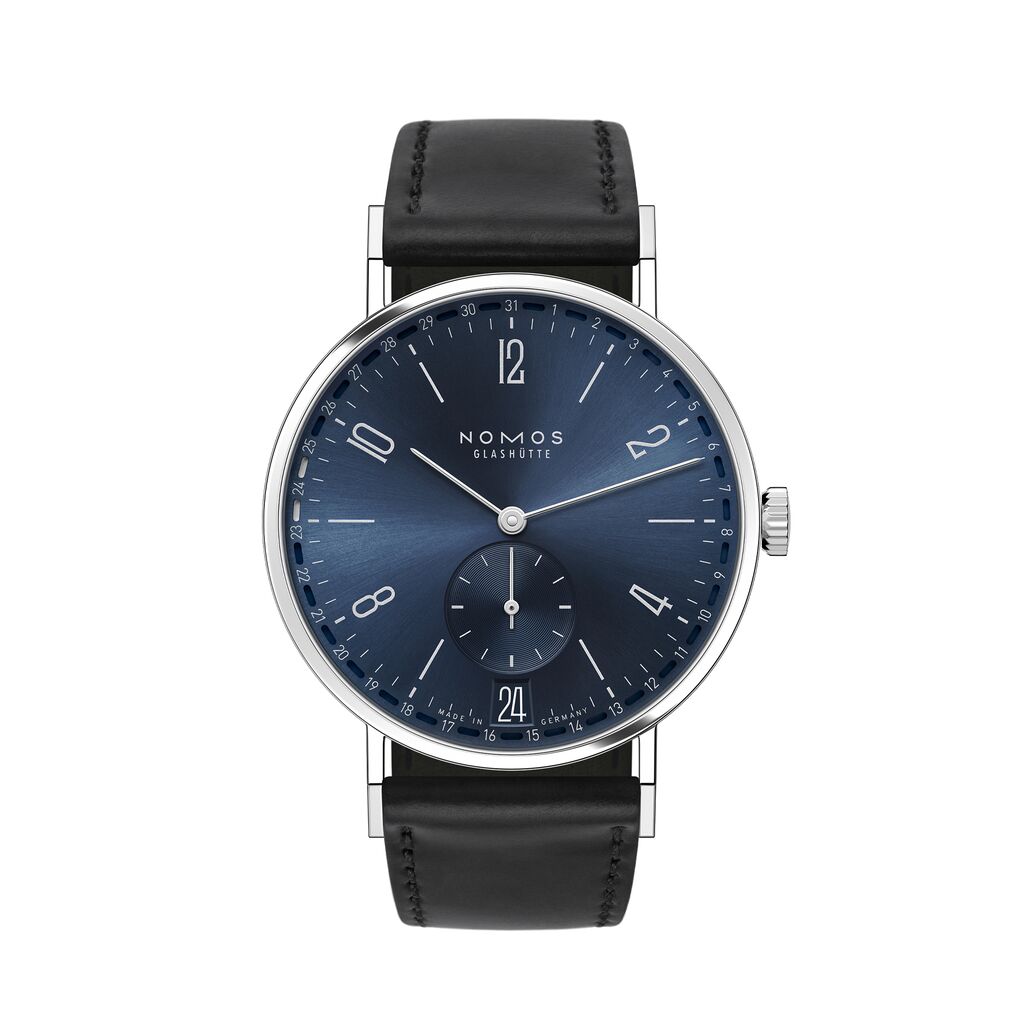
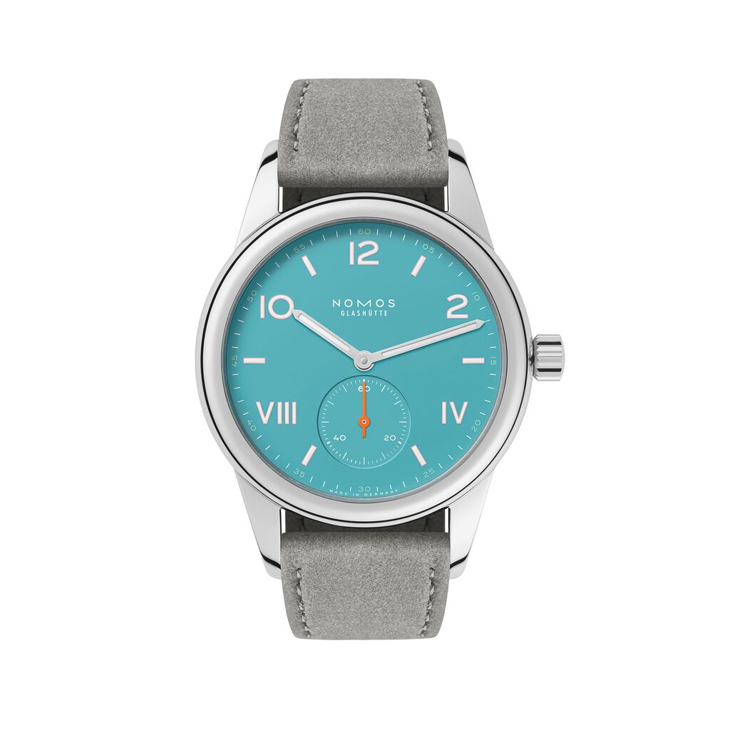
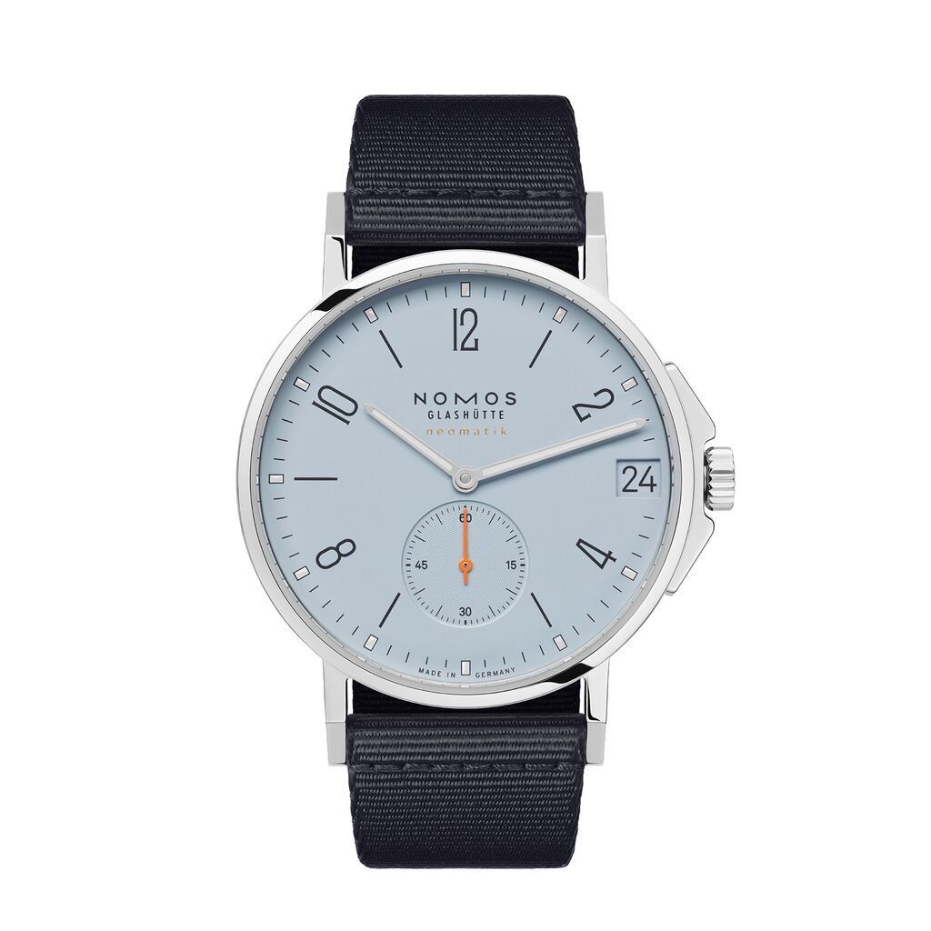
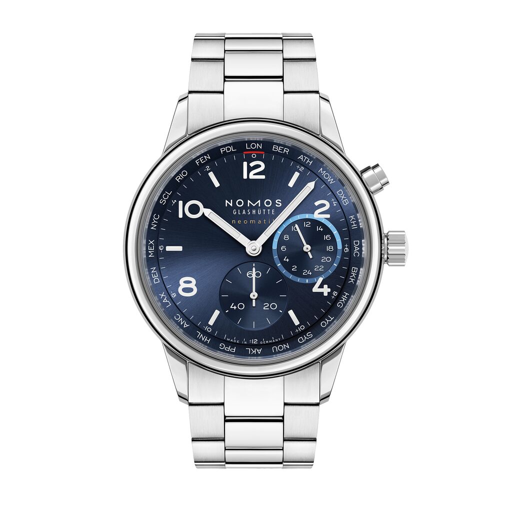
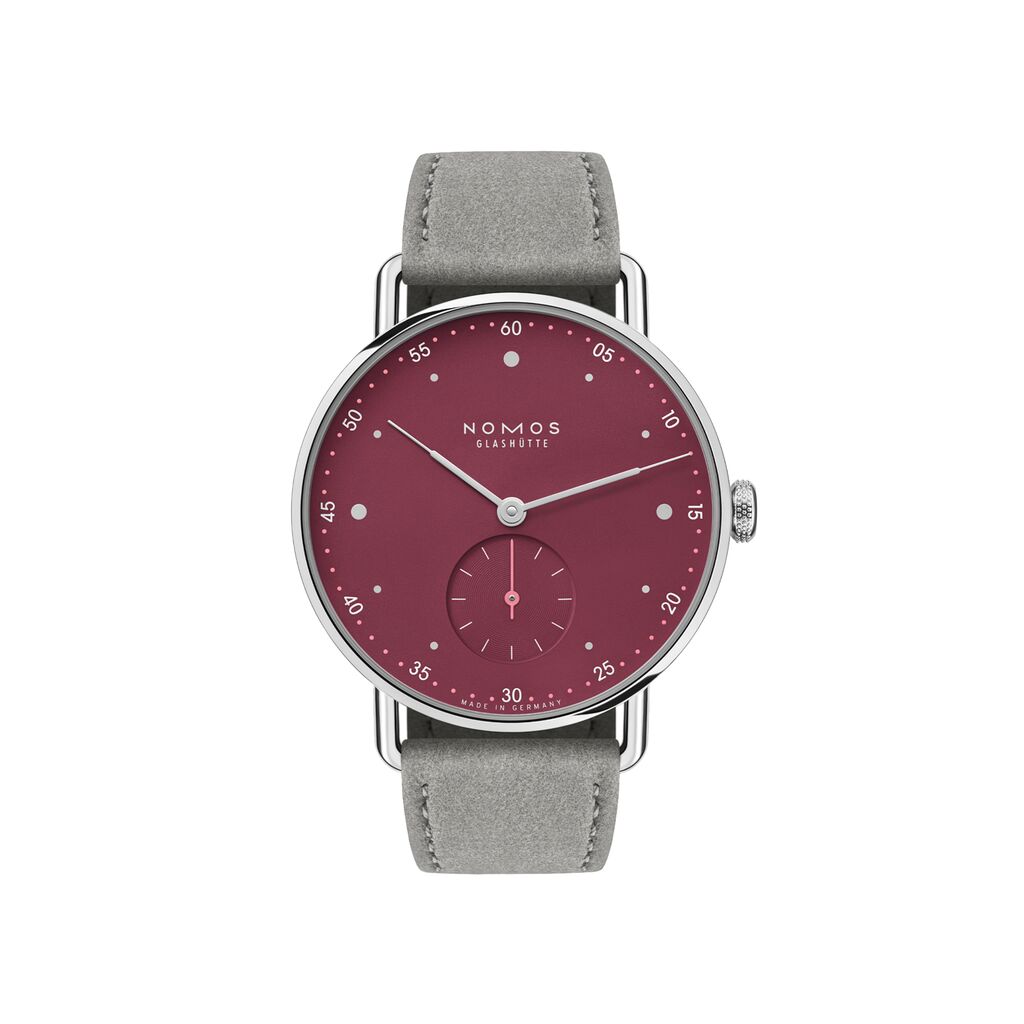
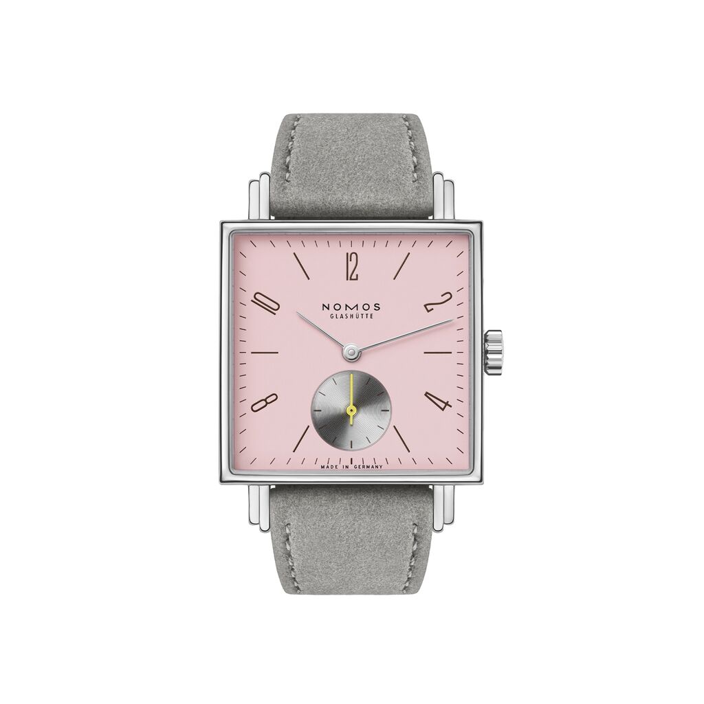
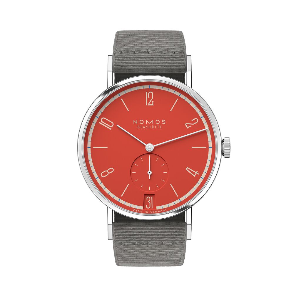
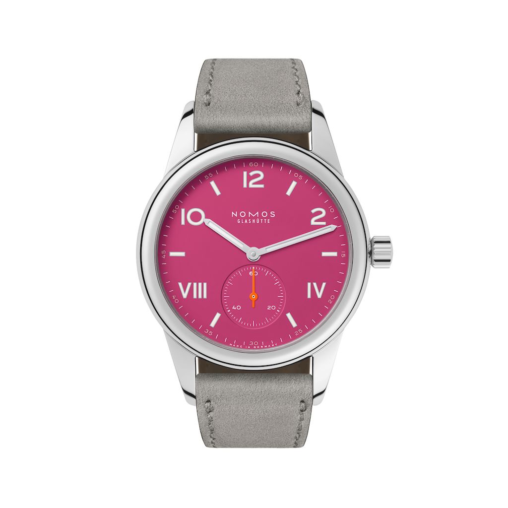
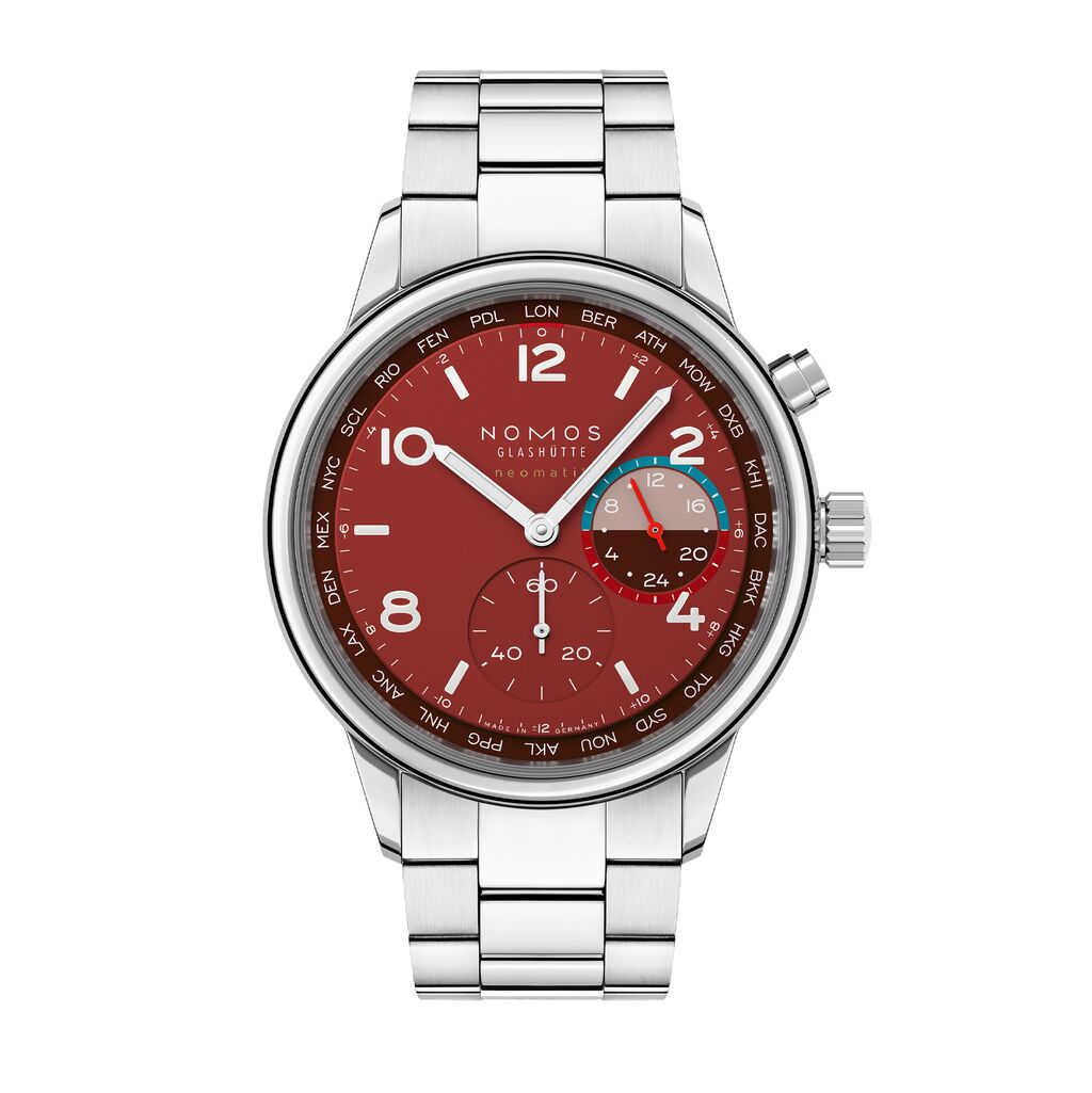
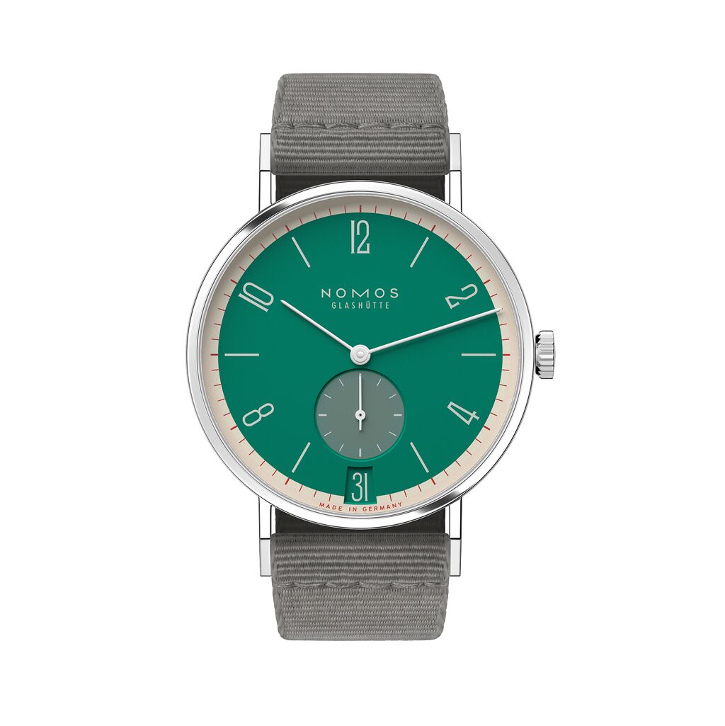
When it comes to choosing the right mechanical watch, the dial color is decisive. It can affect legibility, reflect your personal style, and determine how dated the watch will look in the decades to come. So how do you choose the right watch color? At NOMOS Glashütte we have experts to hand—product designers who spend a great deal of time on this topic. Find their thoughts on this essential aspect of watch design below. With their advice, selecting your next dial color will be easy!
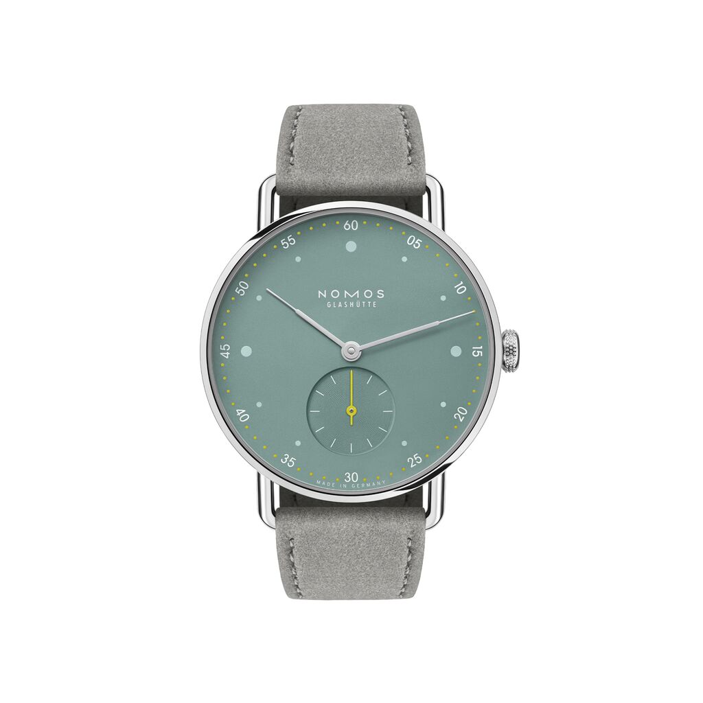
Metro 33 sage
from 2,550 USD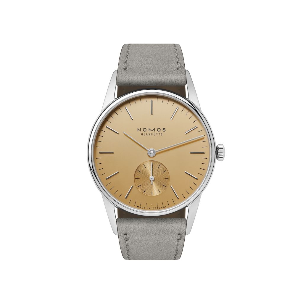
Orion 33 gold
from 2,330 USD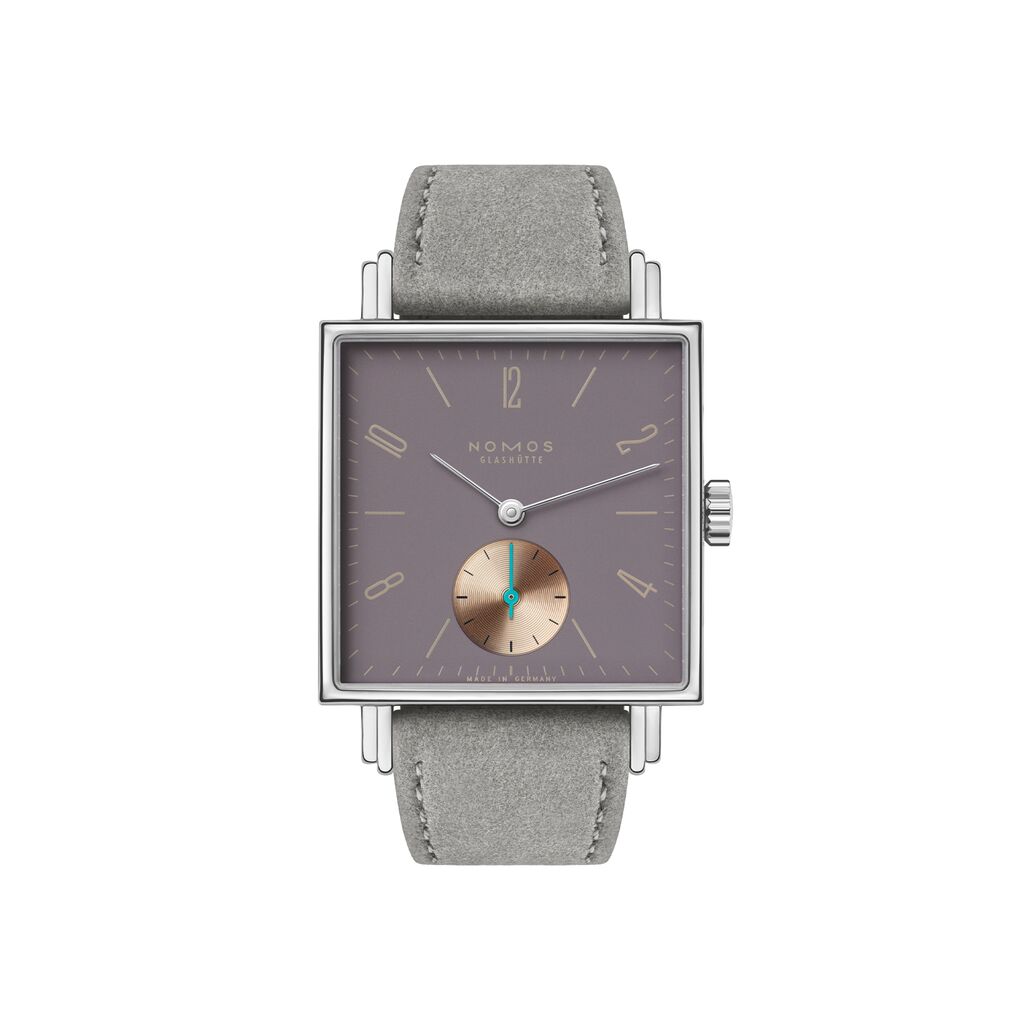
Tetra – Die Fuchsteufelswilde
from 2,570 USD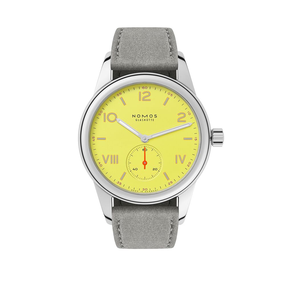
Club Campus starlight
from 1,830 USD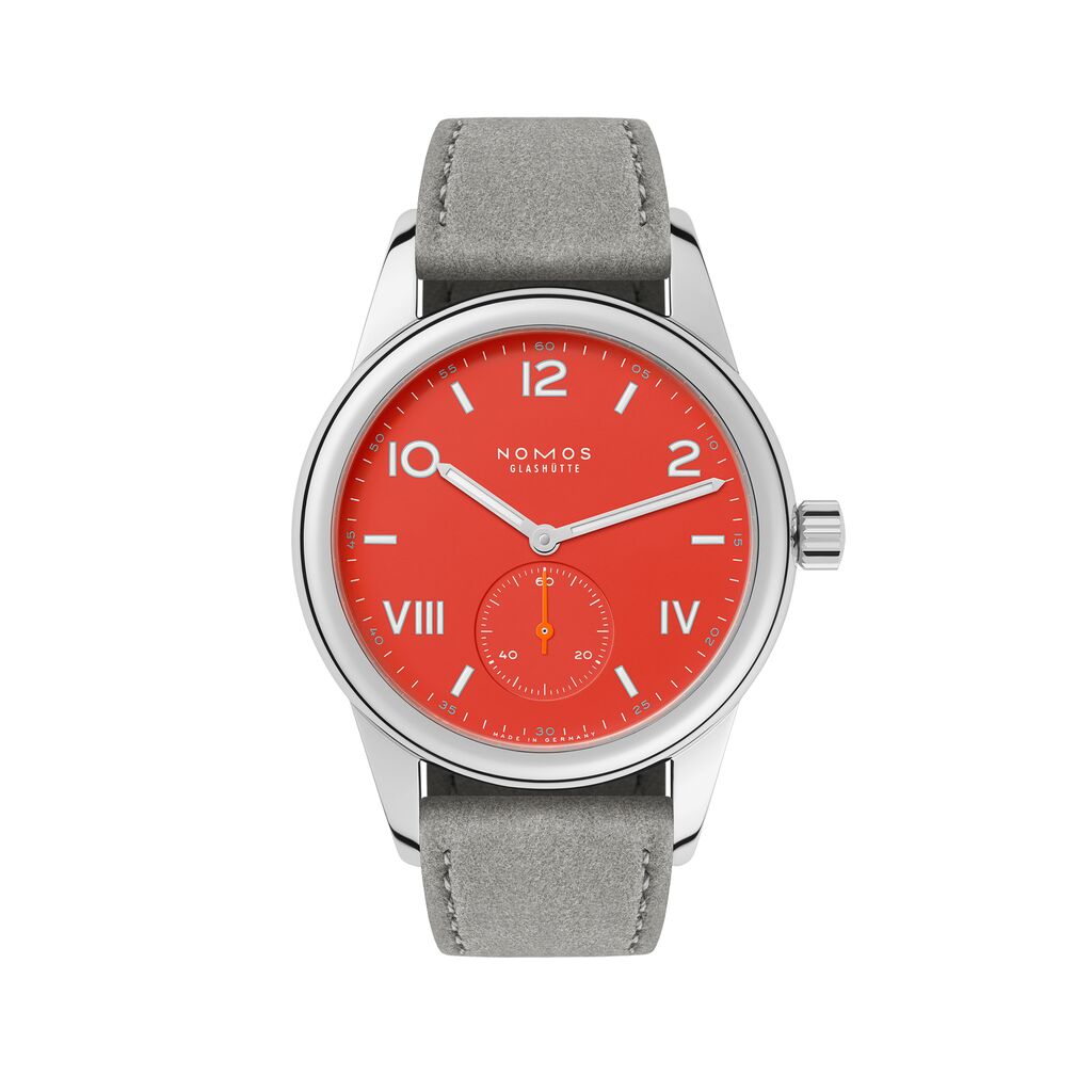
Club Campus nonstop red
from 1,830 USD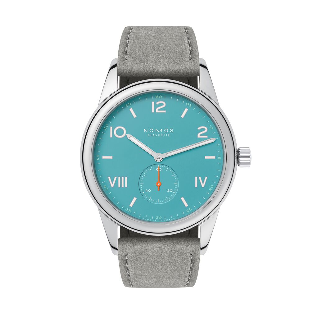
Club Campus 38 endless blue
from 1,960 USD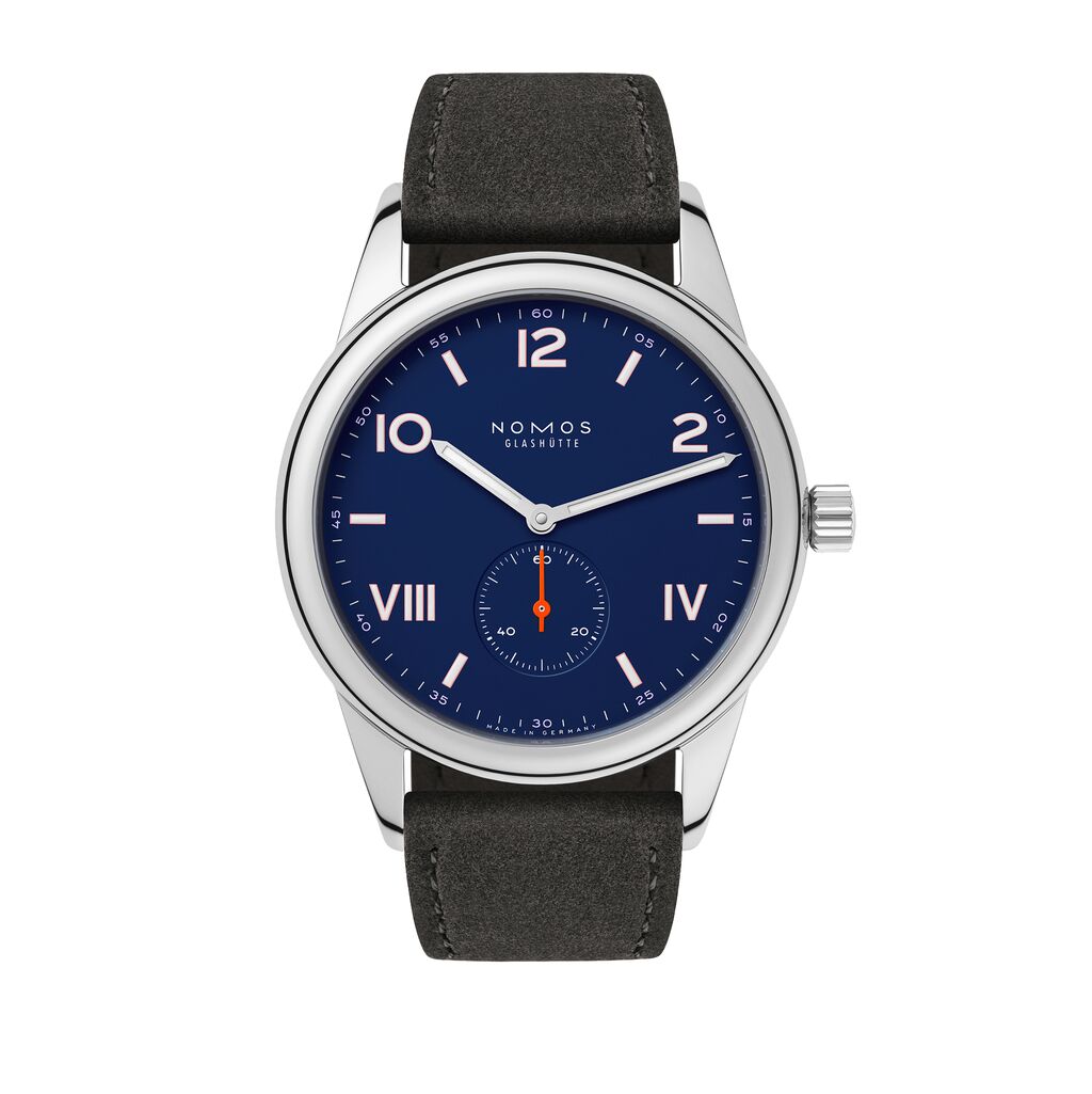
Club Campus 38 night sky
from 1,960 USD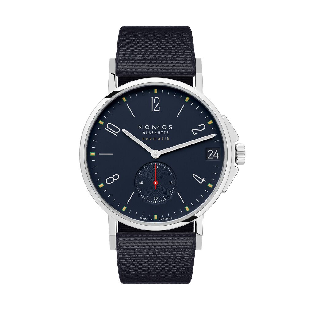
Ahoi neomatik 38 date Atlantic
from 4,910 USD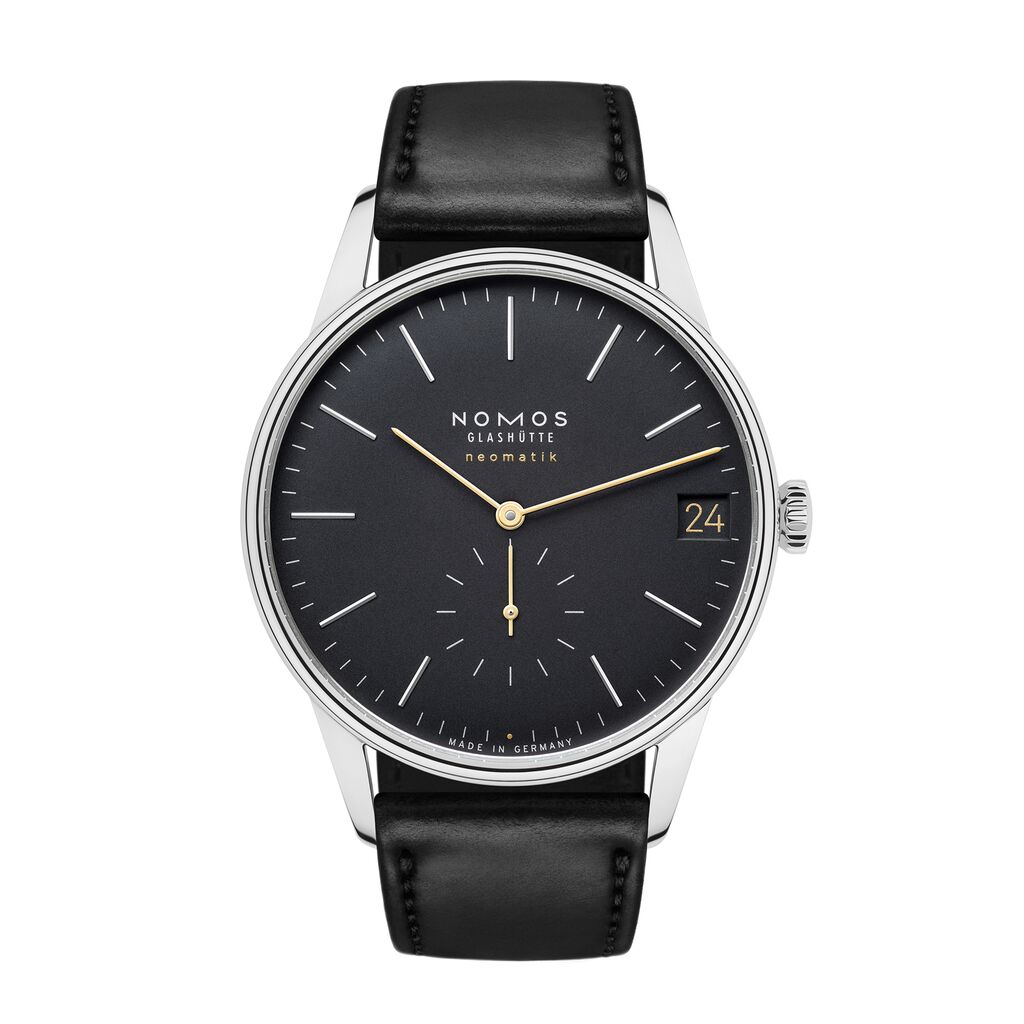
Orion neomatik 41 date new black
4,880 USDWhy are the majority of watch dials white?
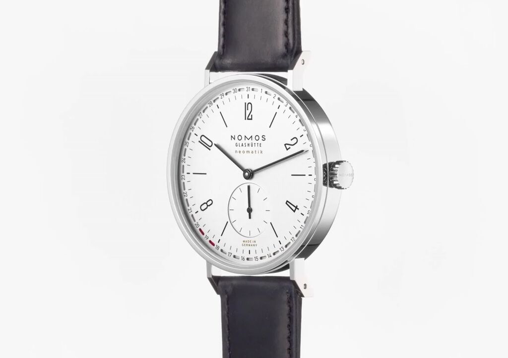
Classic white dials are usually a result of the inherent properties of the materials used to make them. Starting with a blank, a process of silver-plating yields a matte white surface. The clarity and elegance of these white silver-plated dials reflects the watch's essence as a functional measuring instrument and allows other aspects of the watch design to come to the forefront.
Why should you wear a colorful watch?
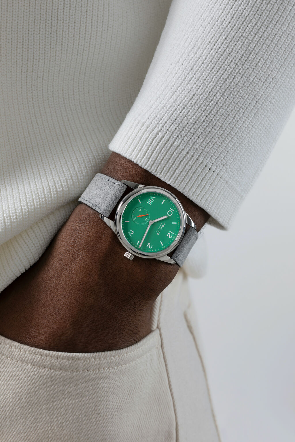
A mechanical watch is more than just a tool for timekeeping. It often serves as a statement piece, reflecting the wearer's personality and taste. Introducing color to a watch dial enhances this aspect of personal expression. Color often introduces an element of fun and playfulness, as well as evoking certain emotions, that enrich the personal connection between the wearer and their timepiece. A watch dial in a wearer’s favorite color or signature shade, for example, has a much deeper emotional significance than the same watch model in white.
Does color also improve the functionality of a dial?
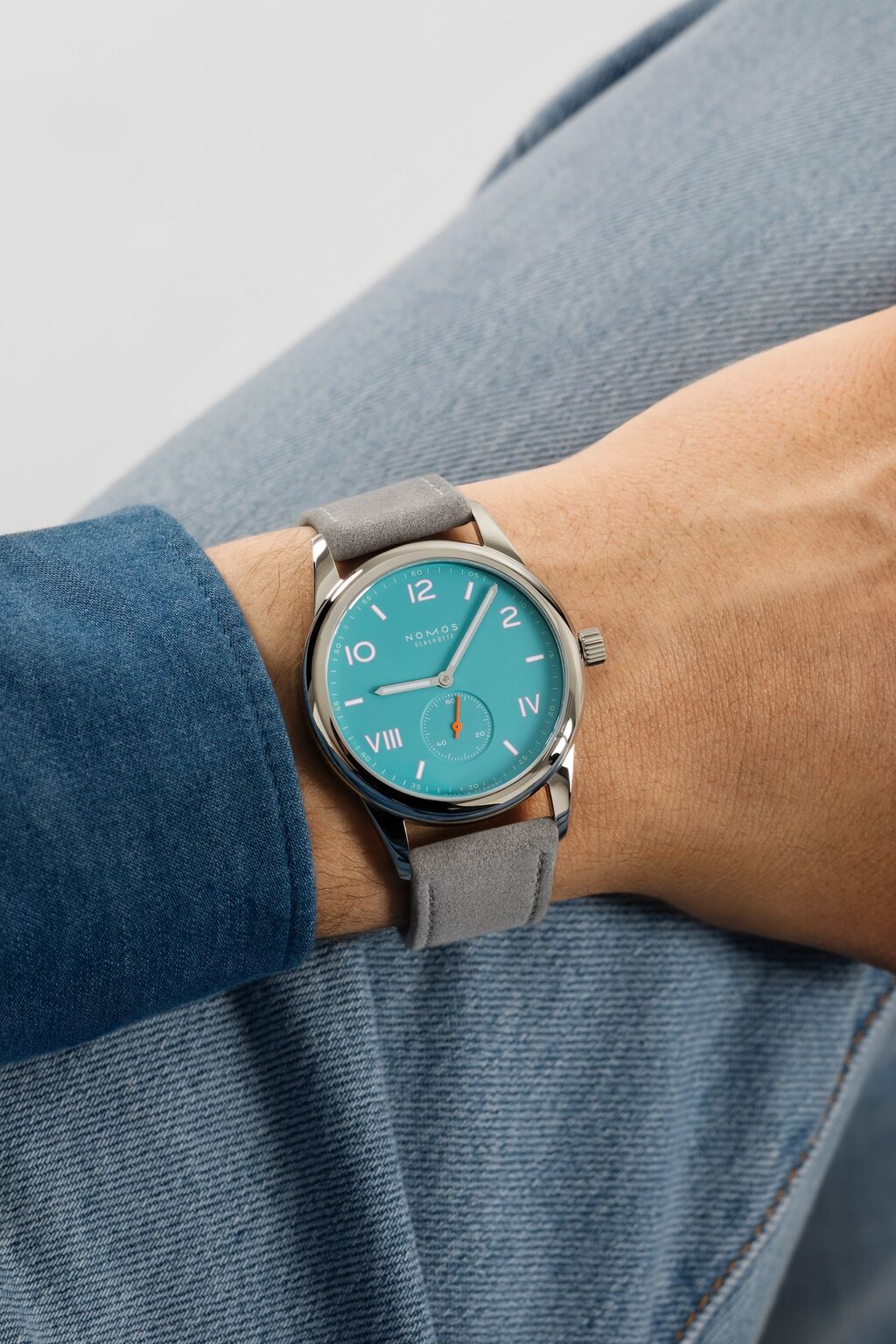
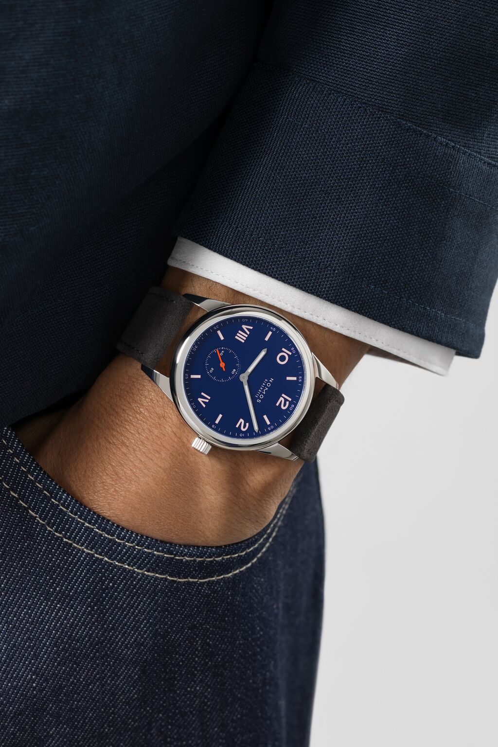
In terms of legibility, the stronger the contrast between colors, the better. So a light dial color works well with dark typography, or vice versa. The use of color on watch dials can enhance the functionality in other ways too. We often add a bright, contrasting color to the seconds hand or the minute markers, as these small details are otherwise hard to see. We also add a colorful outline around the hour typography. This subtle detail is often not noticed at first glance but adds clarity and complexity to the overall dial design. You can find it used to great effect in our Club Campus models, for example.
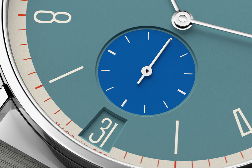
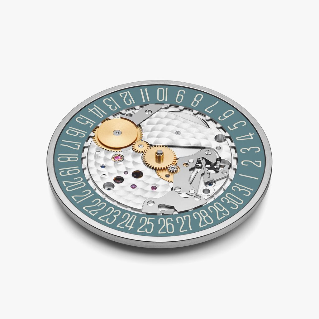
A rare aspect of the handcrafted NOMOS watches is that the date ring is often the same color as the main dial. While this attention to detail makes the watch production more complex, as the calibers must be made especially for a particular watch model, it adds coherence and harmony to the overall design.
So how do you choose a dial color?
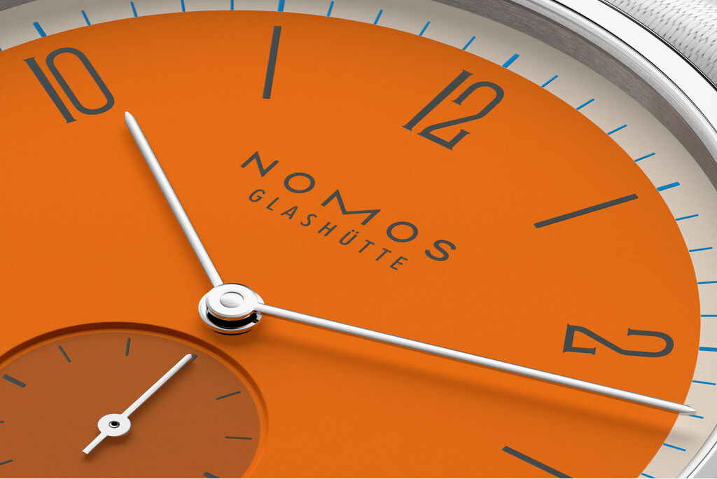
In terms of design, confidence is key—you must be brave enough to try new things. Our approach at NOMOS Glashütte often involves using three, or sometimes four, contrasting colors to create a more complex, refined, and perhaps even surprising dial design. The distinctive appearance of NOMOS watches emerges from this intricate interplay of colors, where unusual color contrasts tend to age more gracefully and maintain their appeal over time.
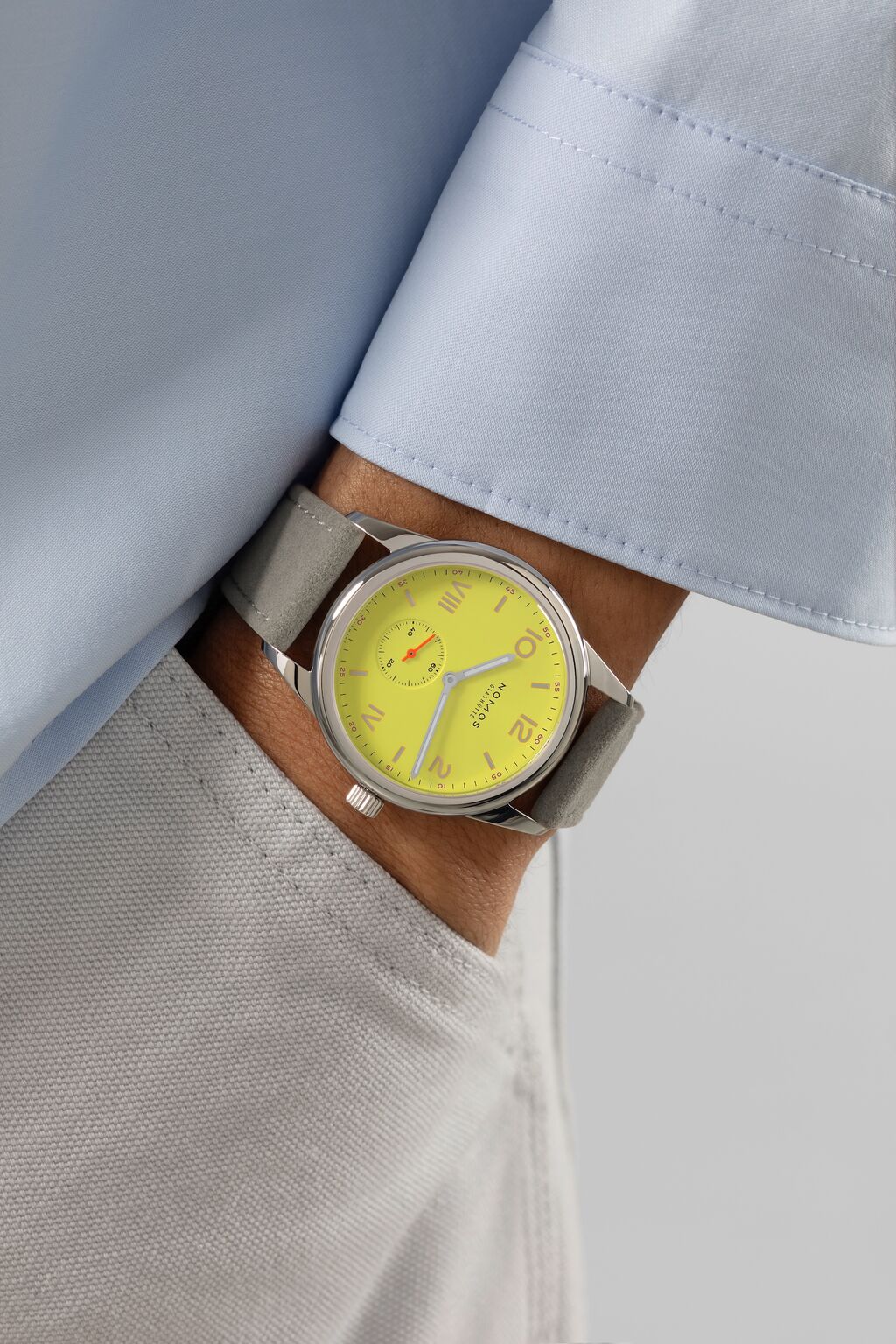
As far as the selection for your own wrist is concerned, an obvious place to start is your favorite color or a distanct color palette of your clothing. But if you wear a lot of one particular color already, it could also be worth considering a contrasting color for your watch instead—for example, bright, primary colors such as red, blue, and yellow, will add a playful counterpoint to mostly monochrome wardrobes.
Watchfinder: find the perfect watch for you
Why do certain colors go out of fashion?
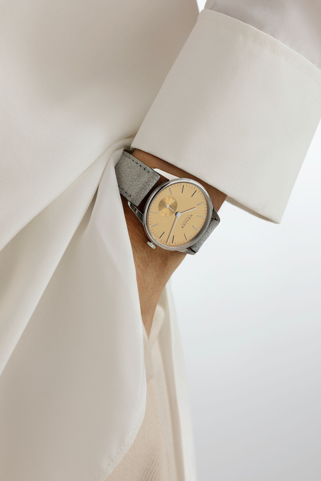
This phenomenon can be attributed to the ever-evolving nature of trends; after all, fashion thrives on novelty. If you start seeing a certain color everywhere—from clothing to watch dials to home furnishings—it is likely to fall out of favor again before long. When it comes to buying watches, avoiding the fashion cycle as much as possible is the best strategy. This way, your investment will retain its appeal and avoid appearing dated in the future.
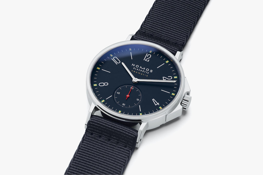
That is why we at NOMOS avoid contemporary trends in our designs and challenge conventional color pairings. We find colors that defy easy classification much more interesting, sparking debate and fascination over their precise hue. Take our Atlantic blue, for example—which is often described as “almost black”. But when contrasted against a black strap, the subtle blue tone of the dial color becomes more apparent. This preference for ambiguous colors plays into a broader dialogue between complexity and simplicity, blending familiarity with novelty. Such colors tend to gain depth and interest with time, which is what we want for watches designed to be worn for the decades to come.
Does adding color to the dial make watches more expensive?
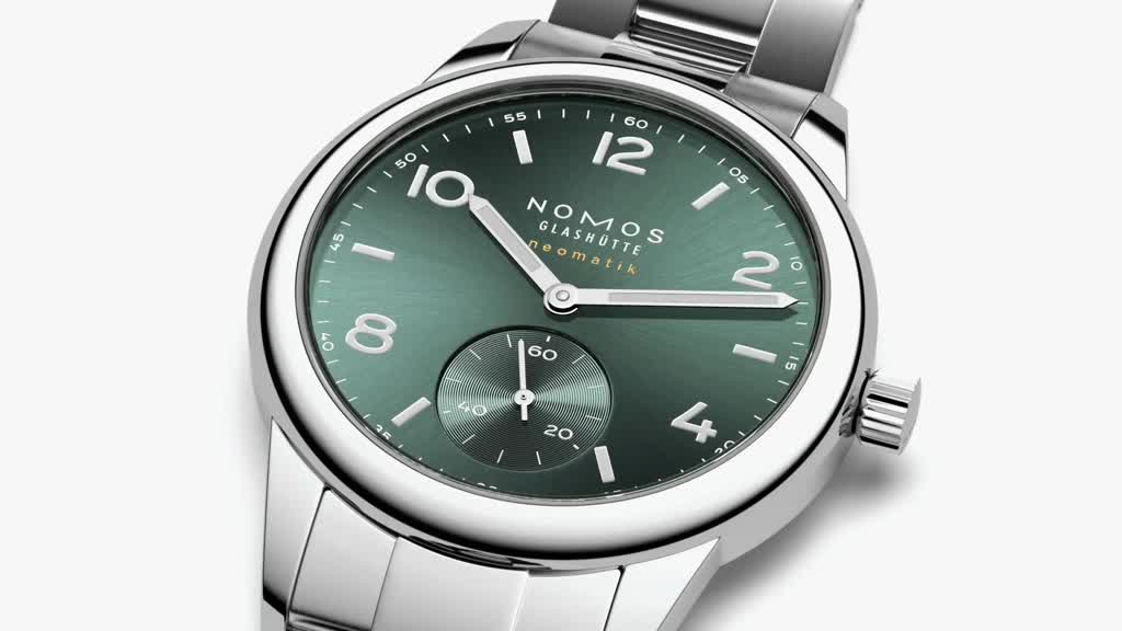
There are many aspects that can affect the cost of producing a mechanical watch—the case material and construction, for example, or the complexity of the caliber within. While it is true that more complex dials require more rounds of prototyping to perfect, it will not inevitably lead to a higher price. At NOMOS Glashütte, our colorful watches come at the same price point as the equivalent white silver-plated versions. However, this is not always the case in the watchmaking world.
How many design elements does the dial of a mechanical watch have?
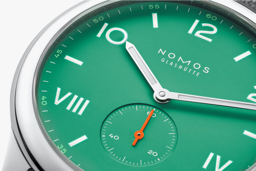
There are many ways to approach dial design, but one way is to view it as three levels—with the first being the dial surface itself. Then comes the typography and other linear elements that are added to it. Finally, the hands can be considered as an additional level on top. Of course, there can be varying degrees of complexity within each level—such as an outer ring around the dial or a Superluminova inlay on the hands.
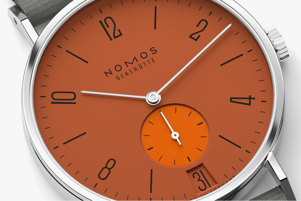
And if the watch features complications like a date function or power reserve indicator, there are even more design elements to consider. That is why it can take multiple prototypes and a great deal of discussion to decide on a final dial design at NOMOS Glashütte. Good things take time!
So how do you choose the best dial color? Is there a dial color that goes with everything?
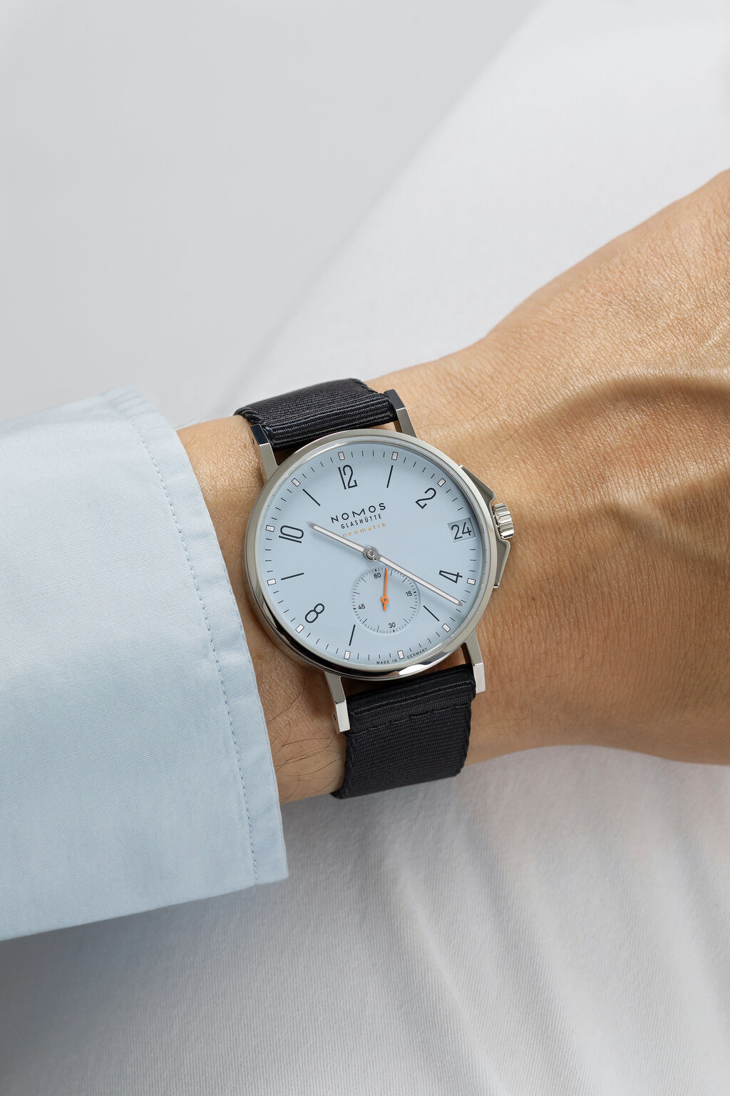
There is no single best dial color—as the exact same shade can look different on different wrists. A good place to start is to consider which colors you like and which ones suit you best. Then think about whether you prefer cool or warm shades. After all, there is a wide range of variety when it comes to each color. A cool blue with hints of gray is very different to a bright sky blue. With this approach you might just find the perfect tone to match your complexion and personality.
Why is color so important at NOMOS Glashütte?
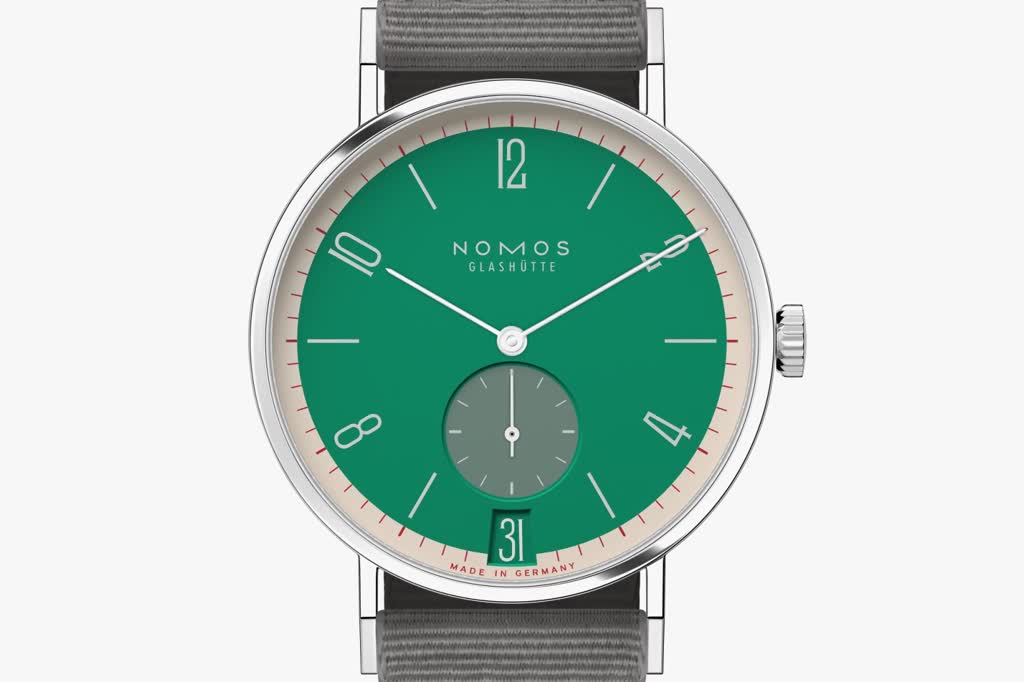
We are known for our outstanding color expertise, both in terms of the complexity of the color tones we select and for the creative use of color in our dial designs. As an independent watchmaking company, we enjoy seeing how color can transform our designs and even have the courage to transform our iconic Tangente model. When it comes to the special edition Tangente 38 date - 175 Years Watchmaking Glashütte, we even did it 31 times. We appreciate the individuality that colorful watches offer and see our colorful watch models as ambassadors of diversity in the world of fine watchmaking, which is still predominantly black and white.
When it comes to color on watch dials, there is so much more to say. We’ve explored this topic—as well as the meaning of the specific watch dial colors—in more detail in our specific color pages, which you can find here:
Black dials
Dark and mysterious, black is often associated with elegance and understatement. Learn more about how to select and style watches with black dials. Our curated selection of watches with black dials:
Blue dials
The world's most popular color looks wonderful when worn on the wrist too. Learn more about how to select and style watches with blue dials. Our curated selection of watches with blue dials:
Red dials
A bold primary color that always makes a statement, red makes a confident impression when worn on the wrist. Learn more about how to select and style watches with red dials. Our curated selection of watches with red dials:
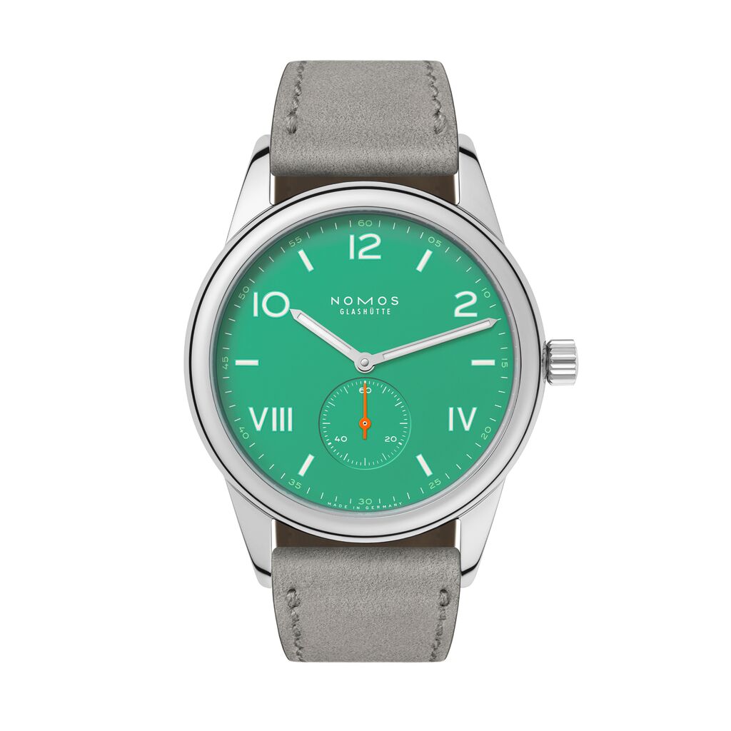
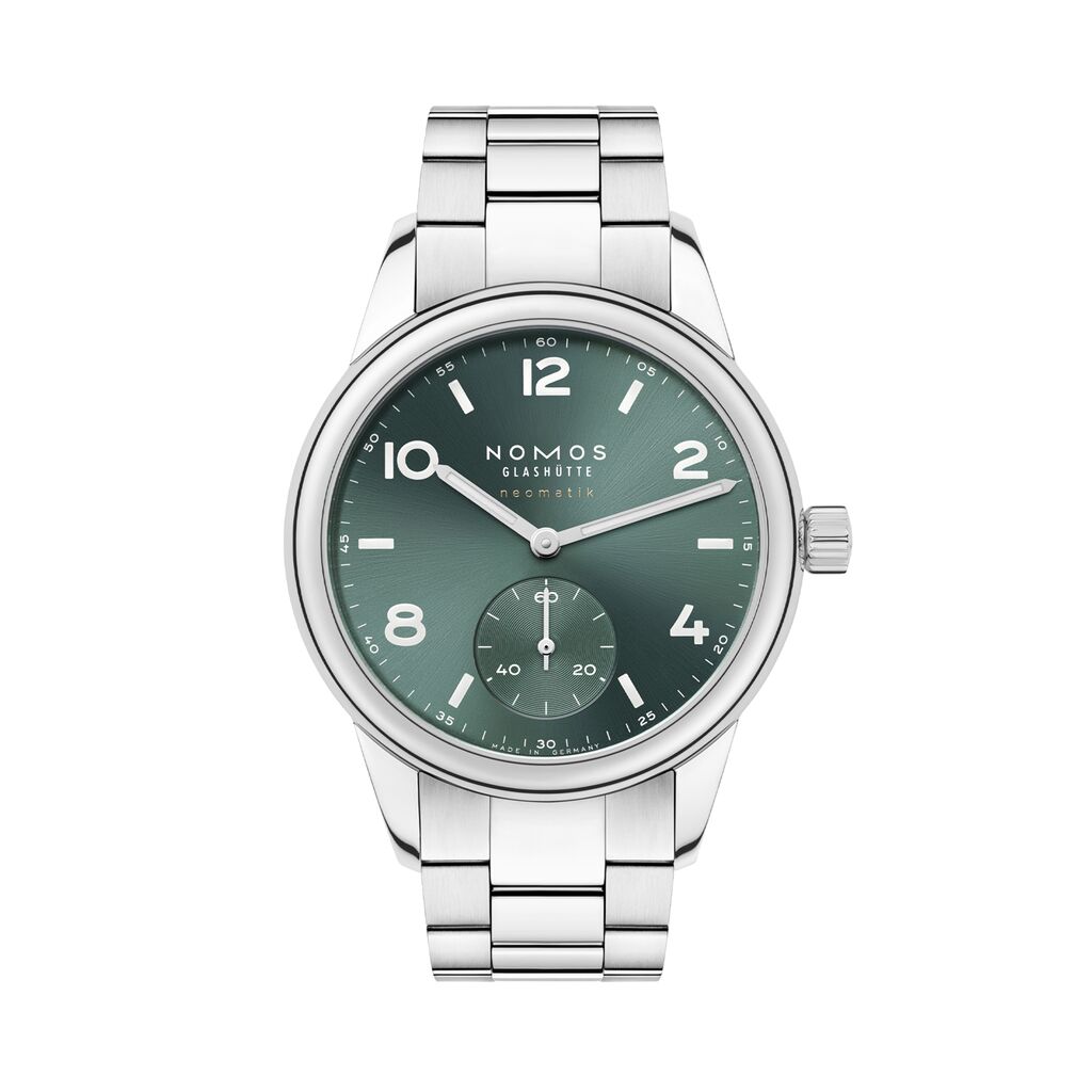
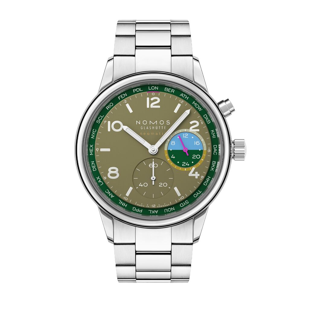
Green dials
Inherently associated with nature, green is often seen as a calming color—although it has bright shades that are highly invigorating too. Our curated selection of watches with green dials:
Multicolored dials
Playful, complex, and often unique, multicolored dials have a lot to offer—and there's more to discover the closer you look. Our curated selection of watches with multicolored dials:
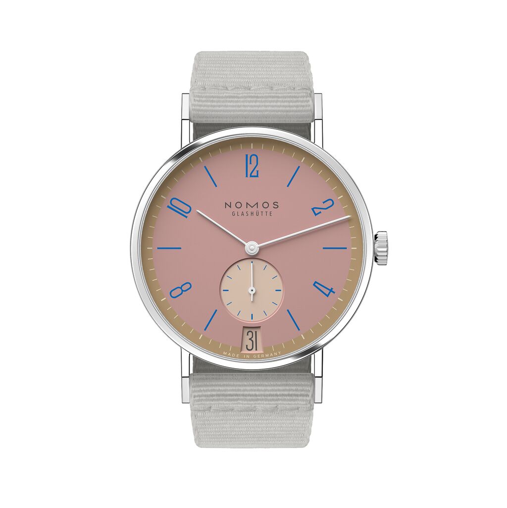
Tangente 38 date Pompadour
2,660 USD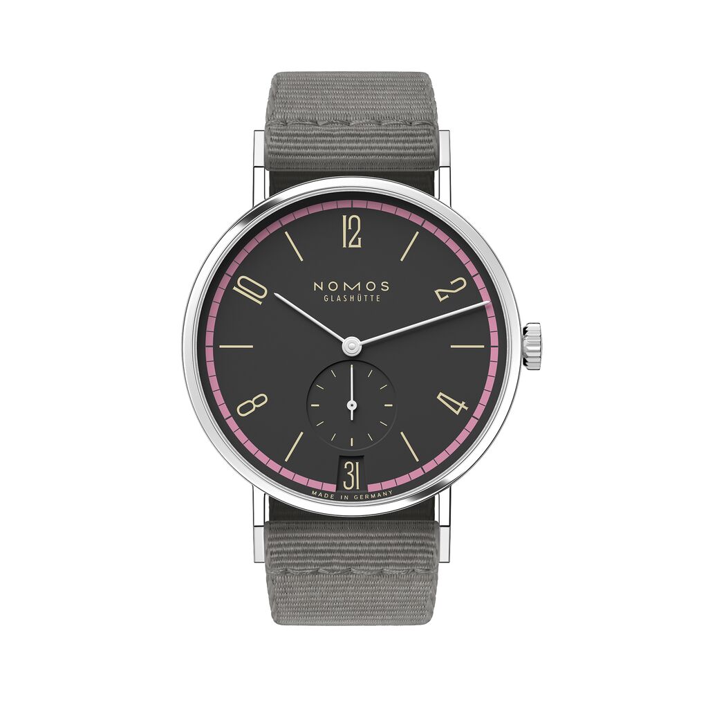
Tangente 38 date Tiefseegrau
2,660 USD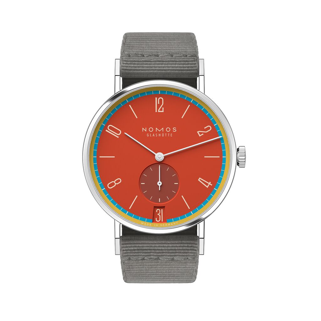
Tangente 38 date Sportbunt
2,660 USD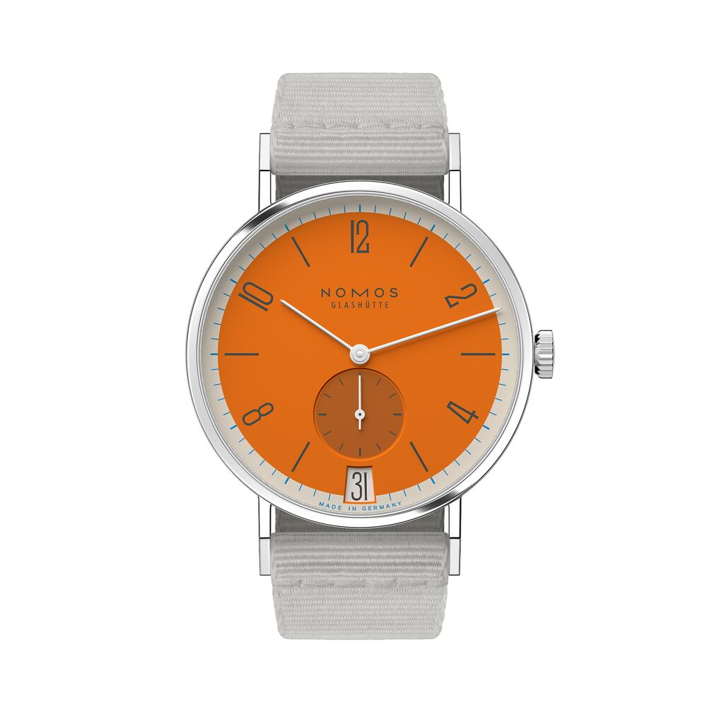
Tangente 38 date Boje
2,660 USD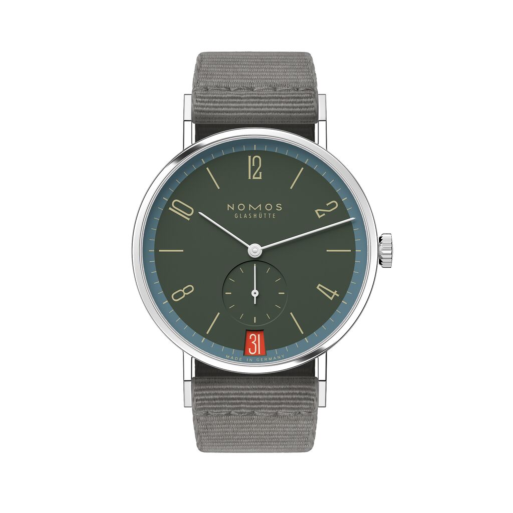
Tangente 38 date Lakritze
2,660 USD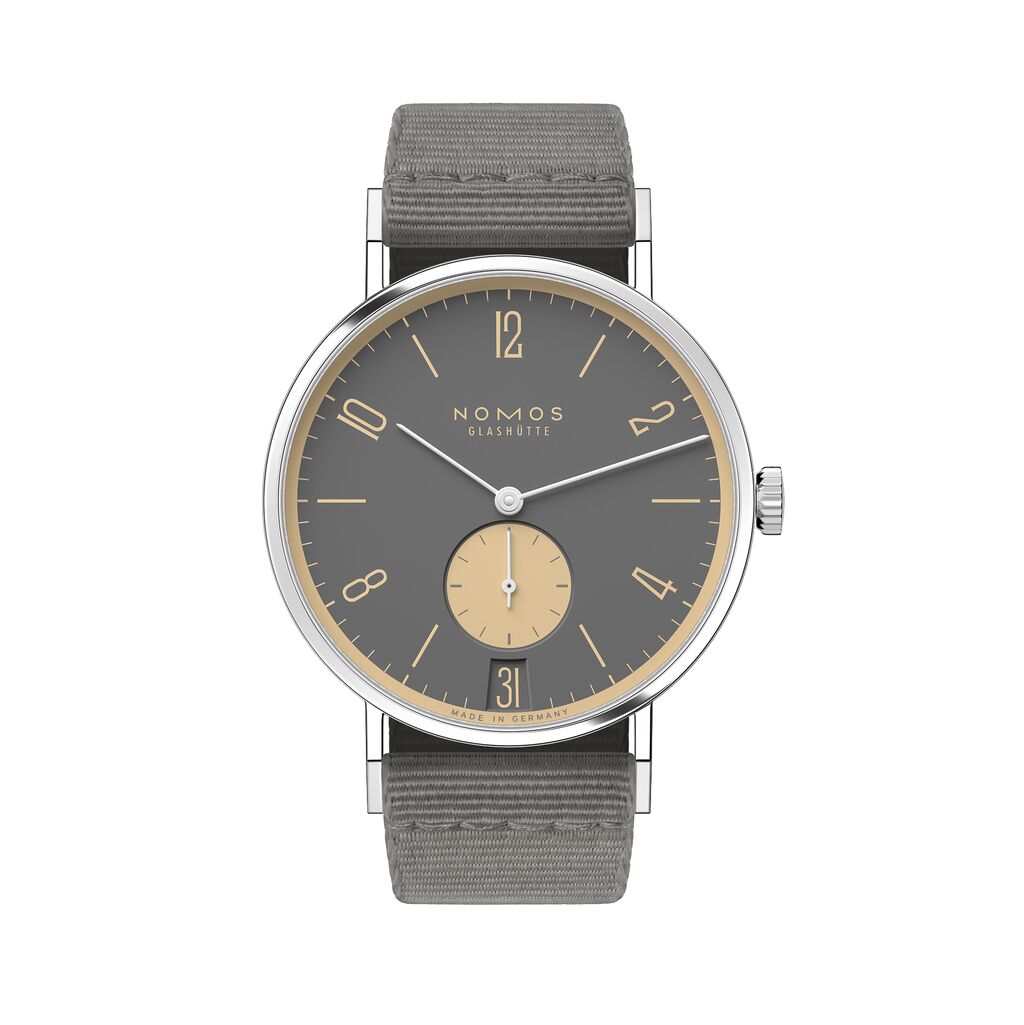
Tangente 38 date Haifischgrau
2,660 USD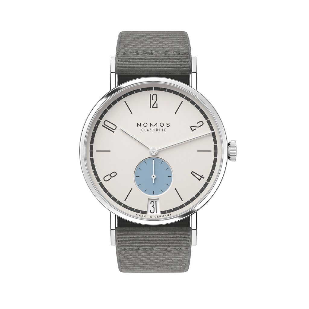
Tangente 38 date Schneesturm
2,660 USD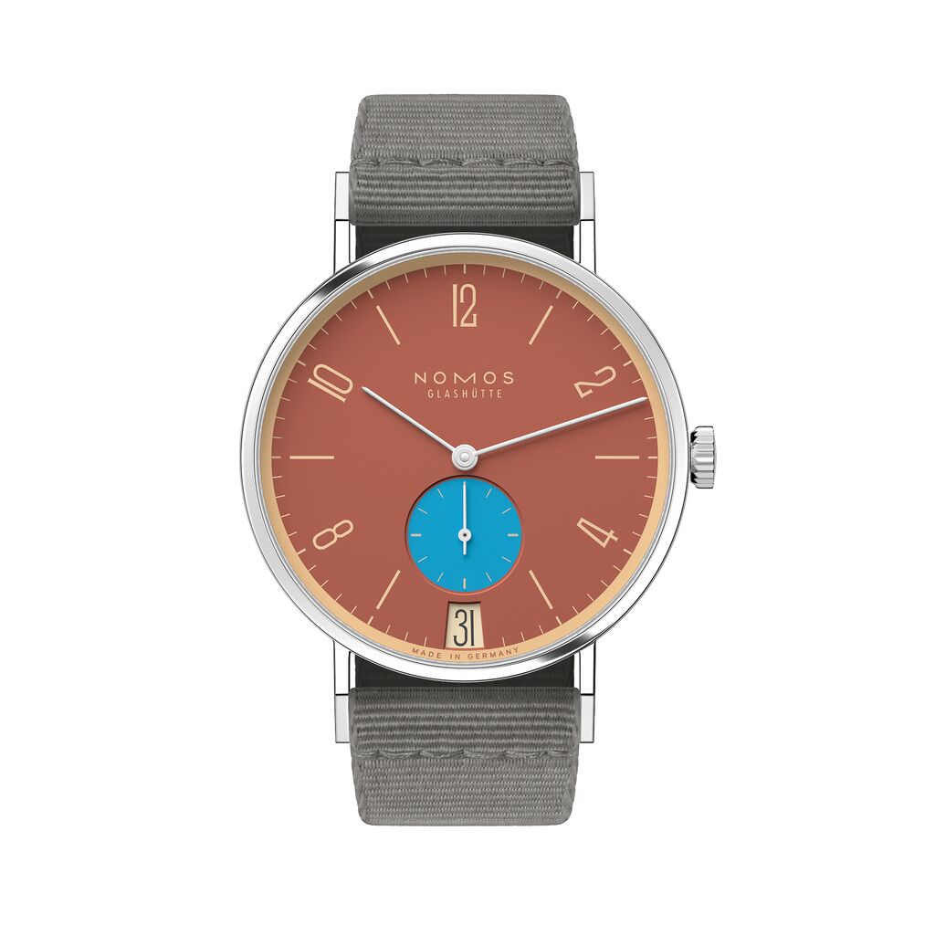
Tangente 38 date Ziegelblau
2,660 USD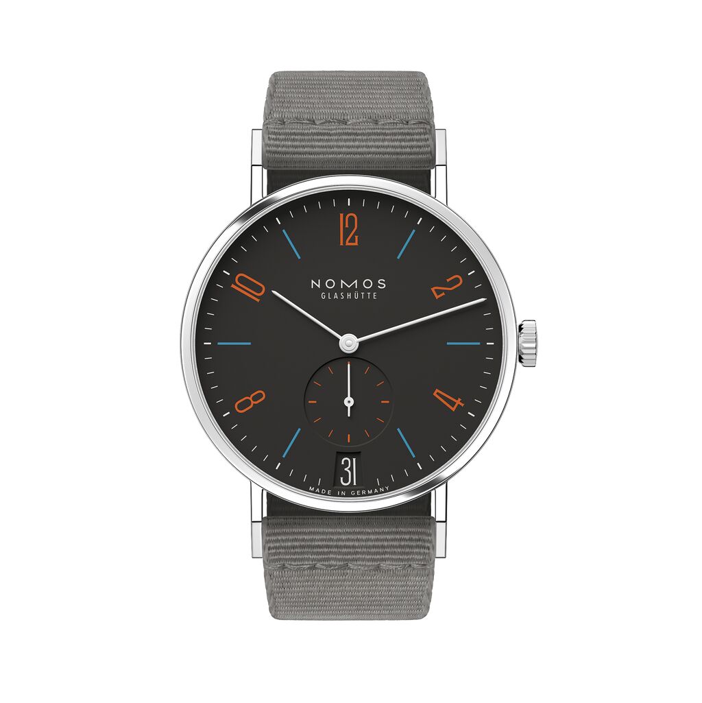
Tangente 38 date Dunkelbunt
2,660 USD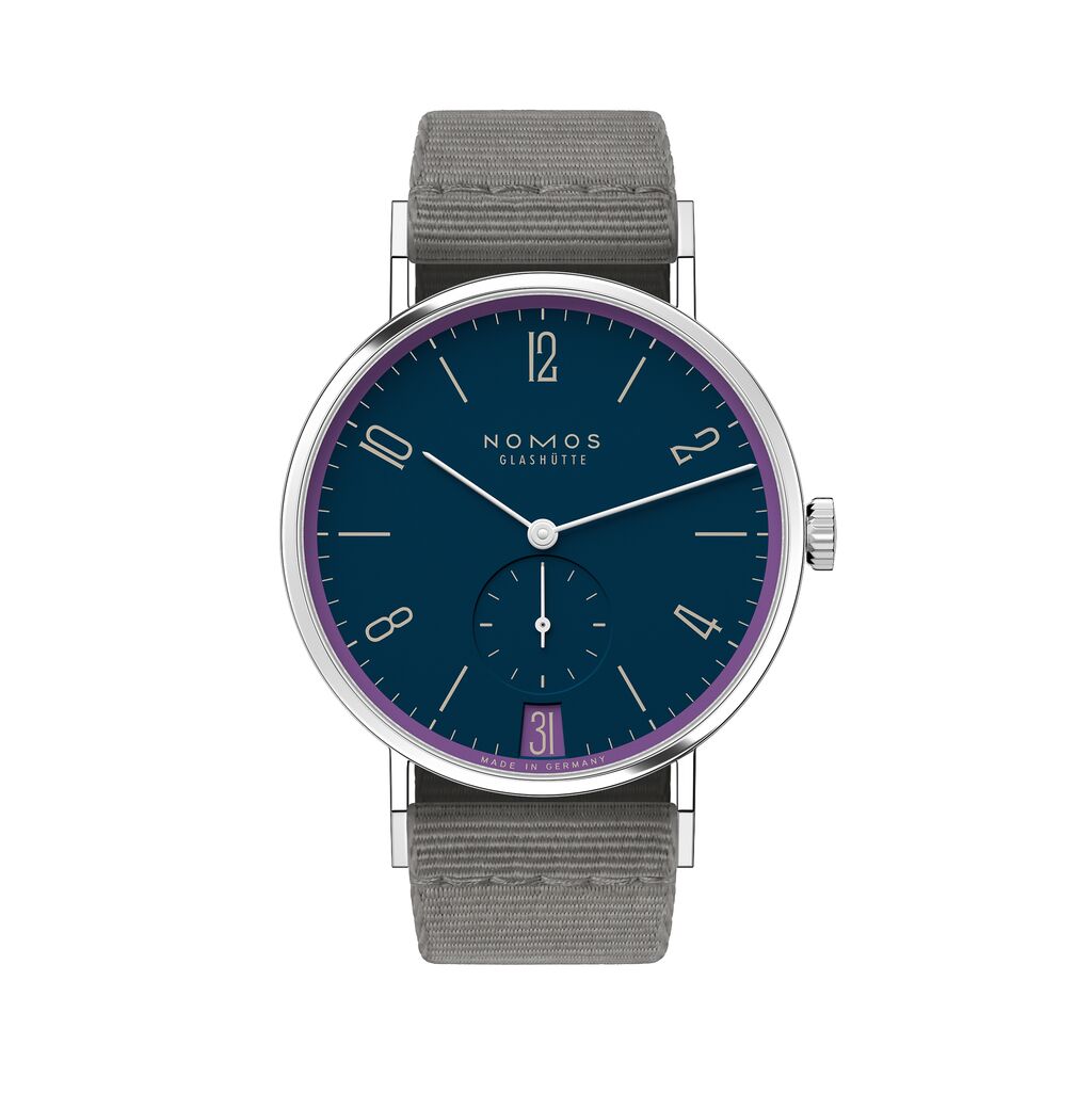
Tangente 38 date Nachtgesang
2,660 USD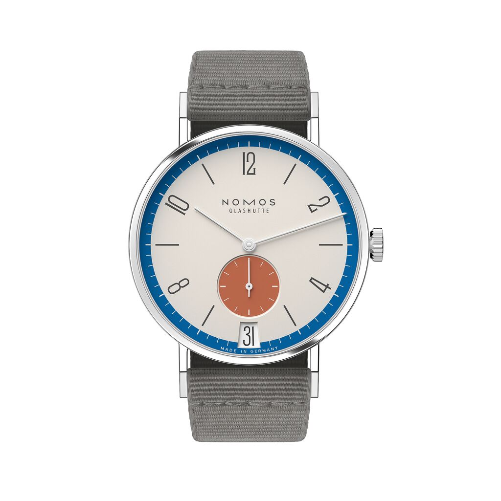
Tangente 38 date Zirkus
2,660 USD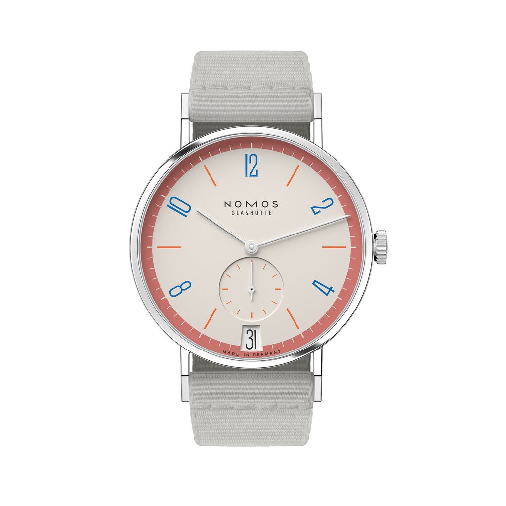
Tangente 38 date Love
2,660 USD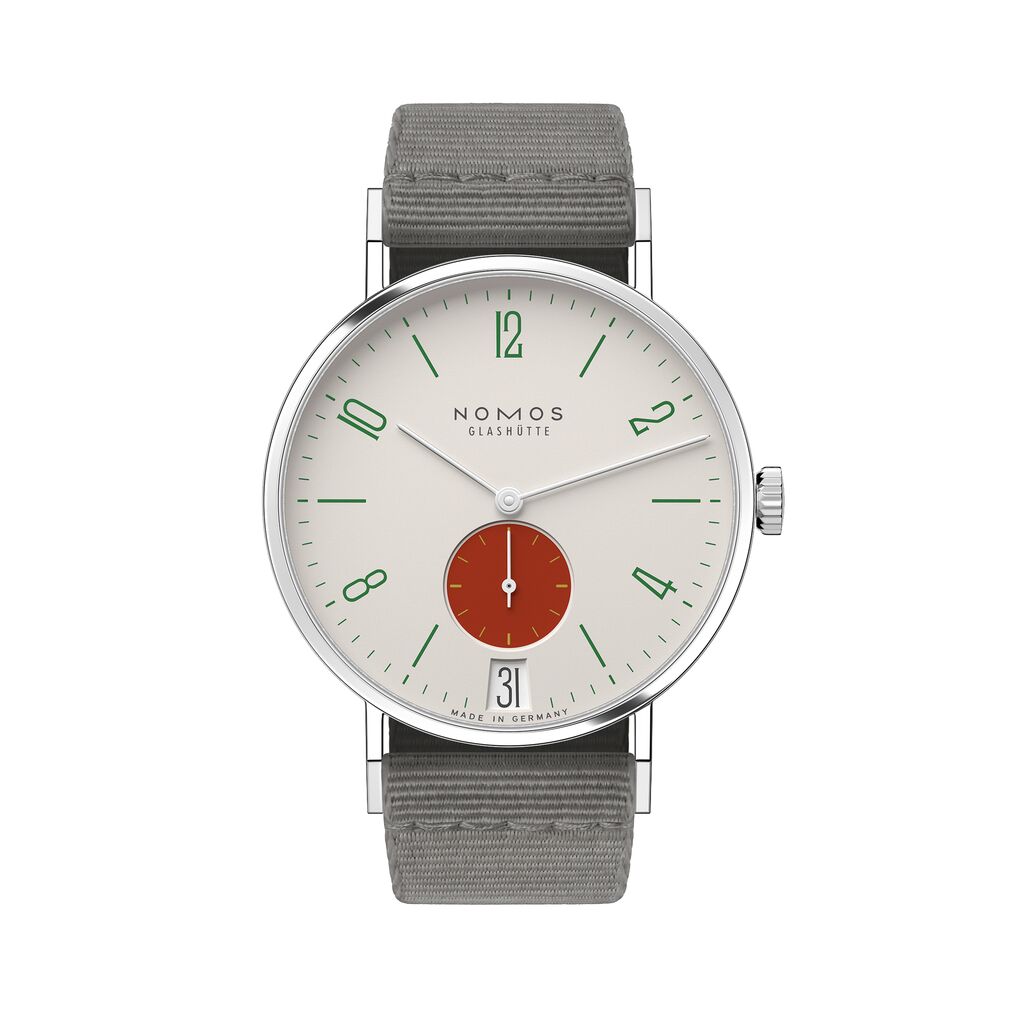
Tangente 38 date Stop
2,660 USD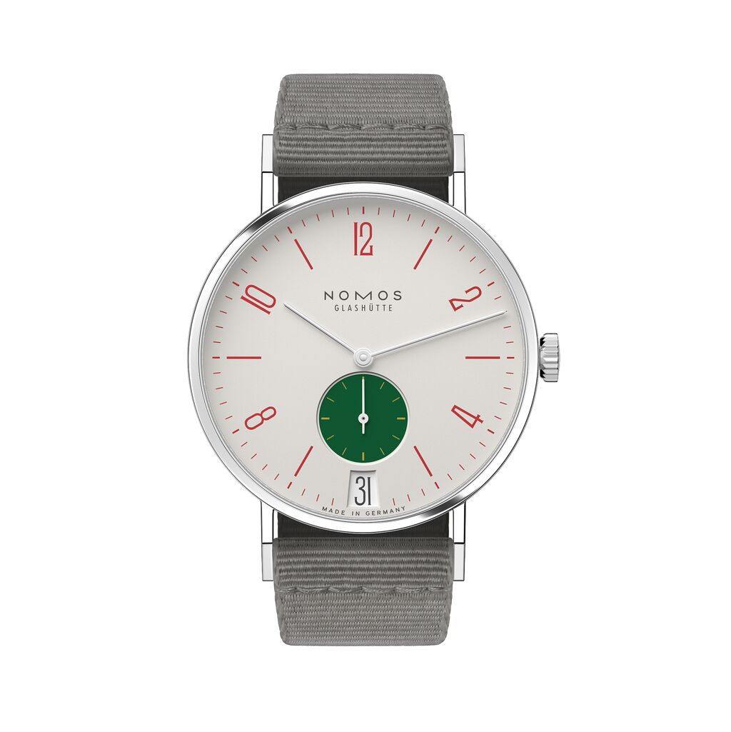
Tangente 38 date Go
2,660 USD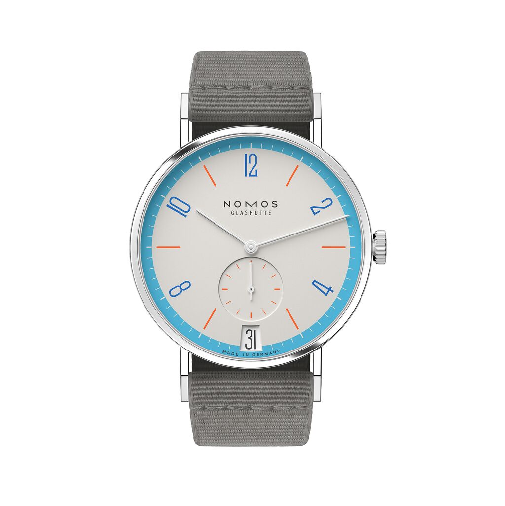
Tangente 38 date Peace
2,660 USD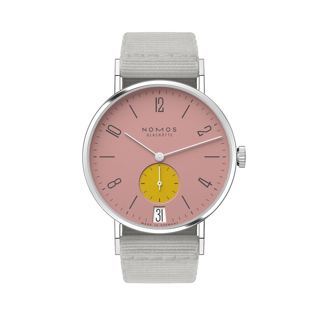
Tangente 38 date Bubblegum
2,660 USD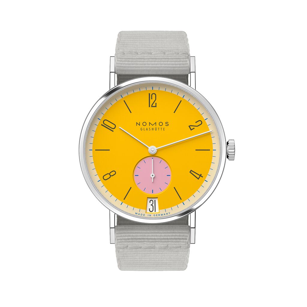
Tangente 38 date Katzengold
2,660 USD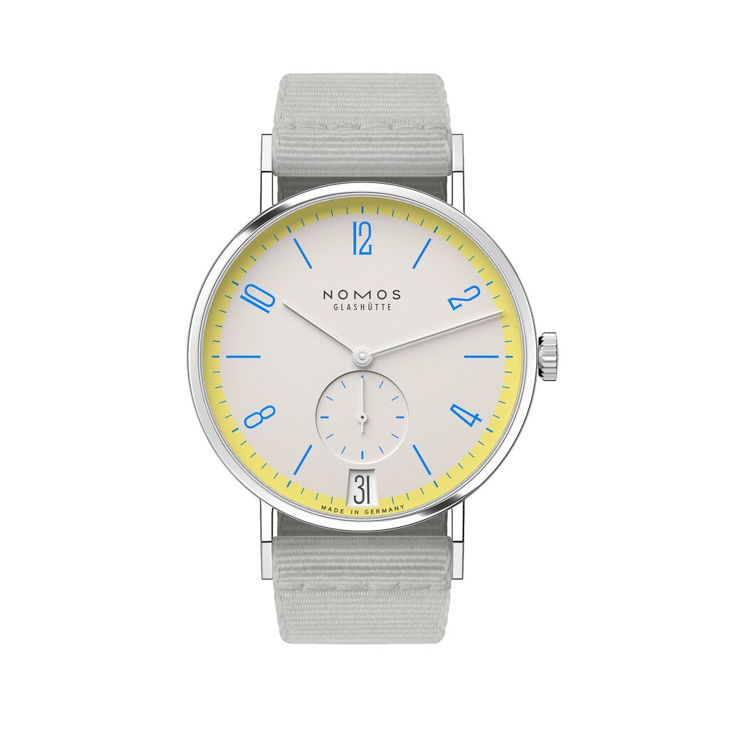
Tangente 38 date Lemonbiscuit
2,660 USD